BeatXP - affordable fitness tech in a competitive market
BeatXP is a fitness technology brand under Pristyn Care, selling smartwatches, wireless earbuds, body massagers, and gym accessories at accessible price points. The brand competes directly with boAt, Noise, and Amazfit all of whom have heavily invested in their digital commerce experience.
In this market, the website is the primary sales channel. If a user lands on a product page and can't quickly understand the value, find the price, or complete the purchase they leave. The old BeatXP website was losing that battle.
A plain website where buying was harder than it needed to be
The brief was simple, the existing site was basic, visually unimpressive, and converting poorly. Users were reaching product pages but not completing purchases.
When we mapped the user journey on the old site, two specific friction points stood out as the primary conversion killers.
The Buy button was buried. The checkout was broken into pieces.
Problem 1 - Hidden purchase intent: On product detail pages, the Buy button appeared only at the bottom of the page after all product specifications and features had scrolled past. A user reading about a smartwatch's features had to scroll all the way to the end to act on their intent. Most didn't. They left.
Problem 2 - Fragmented checkout: The checkout flow was split into disconnected sections. Users saw a product and price summary on one screen, then an address form on a completely separate screen, with no clear pricing visible until the final step. Users couldn't see what they were paying at the moment they were deciding whether to continue.
The specific changes that addressed each problem
- Product images at top
- Product name and price
- Feature 1 description
- Feature 2 description
- Feature 3 description
- Feature 4 description
- Feature 5 description
- Buy button - only here, at the end
- Product images at top
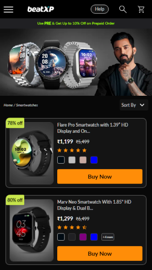
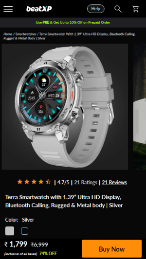
- Product name and price — above fold
- Sticky CTA bar - fixed at bottom always
- Feature 1 description
- Feature 2 description
- Feature 3 description
- Price persists in sticky bar as user scrolls
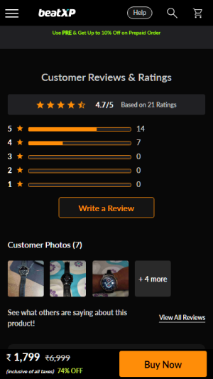
The sticky Buy button always present, price always visible
The core insight was straightforward purchase intent doesn't appear only at the end of a product page. A user might decide they want to buy 30 seconds into reading specs. The interface should let them act on that intent immediately, not make them hunt for the button.
We implemented a sticky CTA bar fixed to the bottom of the product page. It contains the product price and the Buy Now button always in view, regardless of where the user is on the page. When the user scrolls past the product's listed price in the main content, the sticky bar also shows the price, so there is never a moment where the user is reading features but can't see what they're paying.
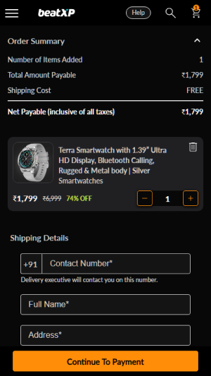
Consolidating checkout into fewer screens, with price always visible
The old checkout flow broke what should be a single decision into multiple disconnected steps. A user who had decided to buy was then asked to navigate through separate screens - price summary, then address, then payment with no persistent view of what they were actually paying. Every screen transition was an opportunity to abandon.
We redesigned the checkout as a consolidated flow. Order summary and address entry appear together, with the total price visible at every stage. The user never has to wonder "how much am I paying?" while filling in their delivery details it's always on screen.
One fewer screen. Price visible throughout. The cognitive load of checkout dropped significantly users always knew what they were committing to and where they were in the process.
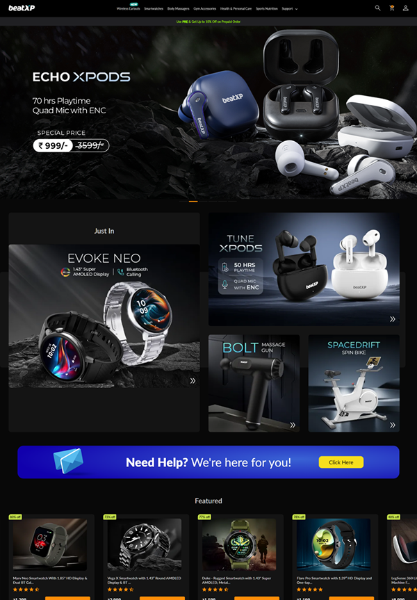
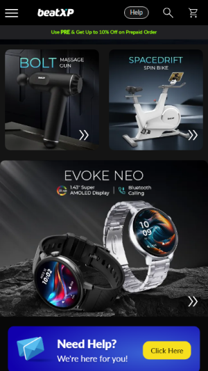
From basic to premium a dark theme that earns trust
The visual redesign was a joint decision between the brand team and design. BeatXP competes with brands like boAt and Noise that have strong, confident visual identities. The old site's plain white aesthetic felt budget which was damaging in a category where perceived quality directly influences purchase decisions.
We shifted to a dark-themed, product-forward aesthetic. High-contrast product photography, bold typography, and an orange accent colour that communicates energy and performance. The design signals that BeatXP products are worth their price point before the user even reads a single spec.
Near-black base
Products pop against dark backgrounds. Feels premium, not budget.
Orange accent
Energy, performance, action. All CTAs use this colour impossible to miss.
Off-white text
Softer than pure white reduces eye strain while maintaining readability.
Desktop - homepage
Mobile - key screens
A live e-commerce site built to convert
The redesigned BeatXP website launched at beatxp.com and has been in production since. The site serves as BeatXP's primary direct-to-consumer sales channel across all product categories.
Purchase intent always actionable
The sticky CTA means a user who wants to buy can act at any moment not just at the end of the page. The Buy button is never more than a glance away.
Price transparency throughout
Price persists in the sticky bar during product browsing and throughout checkout. Users always know what they're paying eliminating a key source of abandonment anxiety.
Checkout reduced by one screen
Consolidating order summary and address into a single step removed unnecessary friction. Fewer screens means fewer opportunities to abandon.
Brand perception elevated
The dark premium aesthetic positions BeatXP competitively against boAt and Noise. The site now signals quality before the user reads a single spec.
What this project taught me about e-commerce UX
What worked
The sticky CTA decision was the highest-leverage change in the entire project. It costs almost nothing to implement but directly addresses the most common e-commerce failure, a user who wants to buy but can't immediately find how.
The lesson, the most impactful UX decisions in e-commerce are often not complex. They're about removing the gap between intent and action.
What I'd do differently
The redesign was driven entirely by a PM brief with conversion targets there was no user research, no session recordings, and no post-launch measurement framework set up before we shipped.
If I did this again, I'd establish the measurement framework before launch, define what conversion metrics we're tracking, set up heatmaps on product pages, and create a baseline to compare against. Good design without measurement is a missed opportunity to prove impact.