A familiar action became unfamiliar overnight
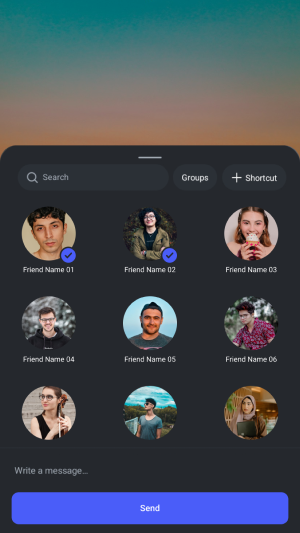
Instagram has over 2 billion active users. For most of them, sharing a reel is a muscle-memory action tap Share, select friends, tap Send. A flow repeated dozens of times until it becomes automatic.
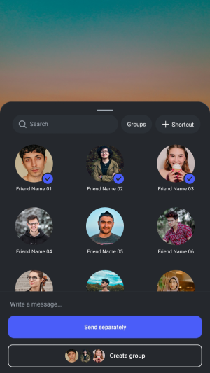
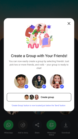
Then Instagram pushed an update. The Send button was replaced by two new CTAs: "Send Separately" and "Create Group." Users who had built years of muscle memory around the Send button now found themselves on a group creation screen with multiple friends added having never intended to create a group at all.
"I'd selected a few friends and tapped where Send used to be. Suddenly I was on a group creation screen with six people in it. I hadn't intended to create a group I just wanted to share a reel."
This wasn't an isolated experience. The pattern repeated across users, people found themselves accidentally added to new groups created by friends who had made the same mistake. The update had broken a mental model that 2 billion people had spent years building.
Step by step where the experience broke down
User opens a reel they want to share
Normal behaviour this part of the flow was unchanged
User taps the Share button
Muscle memory action same as always
User selects multiple friends from the list
Same UI as before no visual change to signal what's coming
User taps where "Send" used to be now labelled "Create Group"
No warning, no confirmation. Tapping proceeds immediately.
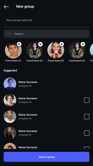
User lands on a group creation screen with all selected friends added
An unintended group has been created. The reel was never sent individually.
User discovers "Send Separately" was the new name for the old "Send"
Only visible after the damage was done no onboarding, no change notification
This wasn't a bad feature. It was a bad transition.
Adding a group creation shortcut to the share flow is a reasonable product decision. Groups are valuable. Making group creation easier makes sense. The failure was not the what, it was the how.
Instagram introduced a new behaviour in the exact location where an existing, deeply familiar behaviour used to live with no warning, no transition, and no way for users to know something had changed until they had already made an unintended action. The feature itself was fine. The release was not.
The UX framework behind the failure
This single update violated four established UX principles simultaneously which is why the confusion was so widespread and consistent across users.
Consistency
The Send button's position and label had been consistent for years. Changing both at once without warning destroyed the mental model users had built through thousands of repetitions.
Change Awareness
No in-app notification, no tooltip, no onboarding moment explained what had changed or why. Users were expected to discover the new behaviour through error an unacceptable standard for a 2-billion-user platform.
Law of Feedback
When a user takes an action that deviates from expected behaviour, the system should provide immediate feedback. Tapping "Create Group" gave no confirmation prompt it executed immediately, leaving users with no chance to course-correct.
Principle of Least Astonishment
Interfaces should behave in ways users expect. Tapping where "Send" used to be should send or at minimum ask before doing something entirely different. This update maximised astonishment at the worst possible moment, the point of action.
One principle violated, one fix required
Each violation had a corresponding solution none of them complex, all of them achievable without redesigning the feature itself.
Keep Send where Send was
The primary action sending the reel to individuals should remain in the primary button position. "Send Separately" should be the default CTA in the same location the old Send lived. "Create Group" should be secondary below it, visually subordinate, clearly optional.
Reverse the button hierarchy. Send (now "Send Separately") remains primary, bottom-most, most prominent. Create Group sits above it as a secondary option available, but not the default action when a user taps at the bottom of the screen.
Tell users before they discover it through error
A one-time contextual notification when a user first opens the share flow after the update. Not a full-screen interstitial just a subtle tooltip or bottom sheet explaining "Creating a group is now easier. Your friends are now one tap away."
A bottom sheet shown once on first share after the update: "New: Create a group with the friends you message most." Dismissable. Never shown again. Costs one interaction, prevents millions of mistakes.
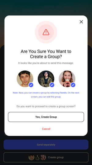
Confirm before creating something the user didn't ask for
If a user taps "Create Group" whether intentionally or by muscle memory a confirmation step gives them a moment to realise what they're about to do. This single addition would have prevented the vast majority of accidental group creations.
A confirmation bottom sheet: "You're about to create a group with [Friend 1], [Friend 2], and 4 others. Continue?" with "Yes, create group" and "Cancel." Two taps to create a group intentionally. Zero accidental groups.
The difference a confirmation makes
Screens
What success would look like
These solutions address the UX failures analytically. If Instagram implemented them, here's what the data should show:
Accidental group creation rate
Groups created and immediately left or deleted within 60 seconds. Should drop significantly with the confirmation step.
Share flow completion rate
Percentage of users who open the share flow and complete a send individually or as a group. Should increase as confusion decreases.
Intentional group creation rate
Groups created where the user also sends a message within the first 5 minutes a signal of genuine intent rather than accident.
The broader lesson
The key insight
Even the largest, best-resourced design teams ship features that violate basic UX principles. Scale doesn't protect you from these mistakes if anything, it amplifies them. A friction that affects 1% of users across 2 billion people is 20 million affected users.
The principles violated here consistency, feedback, least astonishment are not advanced concepts. They're foundational. Violating them on an update that touched the most-used interaction on the platform suggests the change wasn't tested with users who had the existing mental model deeply embedded.
The limits of this analysis
This critique is based on personal experience and UX principles not on access to Instagram's data, A/B test results, or product strategy. Instagram may have had strong engagement reasons for prioritising group creation that aren't visible from the outside.
Good UX critique acknowledges the business context. The goal isn't to say the feature was wrong it's to say the transition was avoidable, and to show specifically how.