Lybrate at scale and what users actually came for
By 2017, Lybrate had grown into one of India's largest digital health platforms with over 80 lakh registered users. The platform served users across three primary areas, free Q&A with doctors (the highest-traffic feature), paid chat consultations, and GoodKart a health products marketplace.
Chat consultations were working but the data and PM feedback pointed to a ceiling in user trust. Patients were engaging, but a significant proportion weren't fully committing to the consultation experience. The platform needed to offer something more credible than text on a screen.
Chat consultations had a trust problem, not a usability problem
"The issue wasn't that chat consultations were hard to use. The issue was that patients couldn't be sure a real, qualified doctor was on the other side."
This is a subtle but critical distinction. The chat flow worked fine. Patients could book, pay, and message. But trust in digital healthcare especially in India in 2016, when online consultations were still a genuinely new concept required more than a text interface could offer.
Three specific problems shaped the brief:
🔍 The trust gap
- Users couldn't verify who they were chatting with
- Text provided no visual confirmation of a real doctor
- Drop-offs in analytics showed hesitation at the payment step
- Users were willing to ask free questions but reluctant to pay for chat
📋 The clinical gap
- Doctors couldn't visually assess patients over chat
- Symptoms described in text are often incomplete or ambiguous
- No face-to-face interaction meant consultations felt transactional
- Post-consultation follow-through was low users forgot advice
Video doesn't just improve the consultation. It proves the doctor is real.
Seeing a doctor's face on screen their clinic background, their white coat, their direct eye contact communicates credibility that no amount of text or star ratings can replicate. The primary job of this feature wasn't to be a better version of chat. It was to make patients feel safe enough to trust Lybrate with their health.
Every design decision that followed was filtered through this lens, does this make the patient feel more confident and secure, or less?
What changes when a patient can see their doctor
Qualitative assessment based on PM feedback and competitive research inputs. Formal measurement was not conducted.
Every decision built toward one goal - patient confidence
Doctor profile shown before booking not after
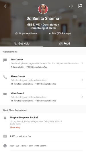
We placed the doctor's full profile credentials, specialty, years of experience, ratings as the centrepiece of the booking flow, not a side detail. The patient selects a doctor first, sees who they're talking to, and only then proceeds to schedule and pay. This front-loaded trust at the moment of highest hesitation the payment decision.
Pre-call checklist preparing patients who had never done this before
In 2016-17, many Lybrate users had never had a video consultation with a doctor. We designed a pre-call checklist screen that appeared before joining confirming connectivity, camera permission, and what to expect from the session. This served two purposes reducing call failures due to unprepared patients, and easing first-time anxiety about a genuinely new experience.
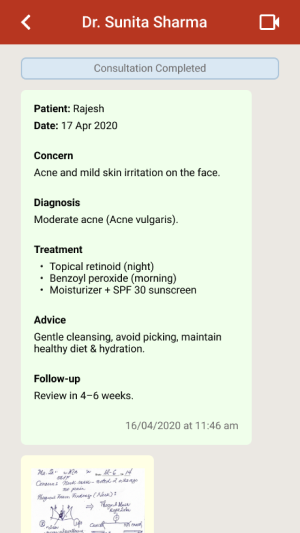
The post-call summary designed during a brainstorm, solved a real problem
During design discussions, the team identified a recurring issue with chat consultations patients forgot what the doctor told them. Medical advice given during a consultation often gets lost. The post-call summary screen automatically generated after the video call, showing diagnosis, advice, and prescription emerged from an internal brainstorm. It turned out to be one of the most valued parts of the feature. The consultation didn't end when the call did.
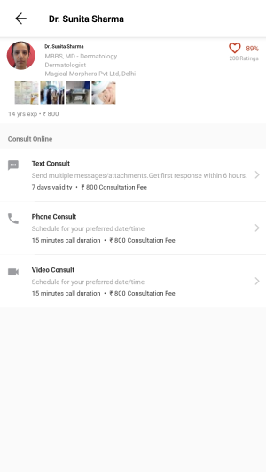
Consultation type selection giving patients agency
Rather than defaulting to one consultation type, we designed the doctor profile page to clearly present Text, Phone, and Video as three distinct options with transparent pricing. This gave patients genuine choice and reduced the perception that video was being pushed on them. Users who weren't ready for video could still use the platform and those who chose video did so with full awareness of what to expect.
From home screen to prescription in hand
Discover - search or browse by specialty or condition
Users enter via home screen search, condition categories (e.g. Hair Fall, Diabetes, Knee Pain), or common specialties. All paths lead to the doctor listing.
Select doctor - full profile, ratings, and consultation types
Doctor profile shows credentials, experience, clinic location, patient ratings, and the three consultation options with clear pricing. Trust is established here before money is asked for.
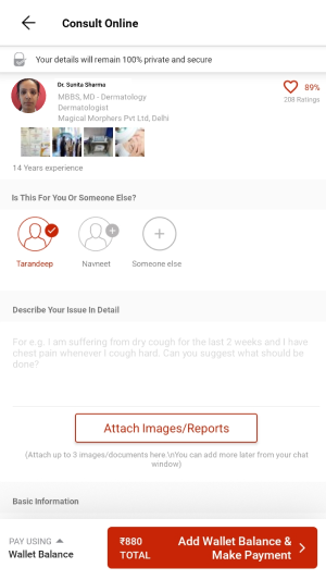
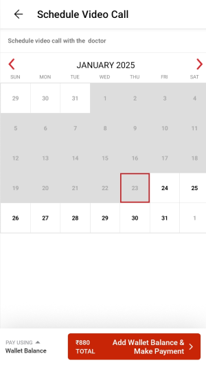
Book - patient details, symptom description, date and time
Patient enters their details, describes their issue in their own words, and attaches any relevant previous reports or images. Date and time selection for the video call follows.
Pay - order summary with transparent fee breakdown
Clear breakdown of consultation fee and internet handling charges. LybrateCash rewards shown. One-tap payment. Confirmation screen with call scheduled time prominently displayed.
Pre-call - text chat opens with patient data pre-loaded
After booking confirmation, a chat thread opens between patient and doctor pre-populated with the patient's submitted details so the doctor arrives prepared. The video call triggers automatically at the scheduled time.
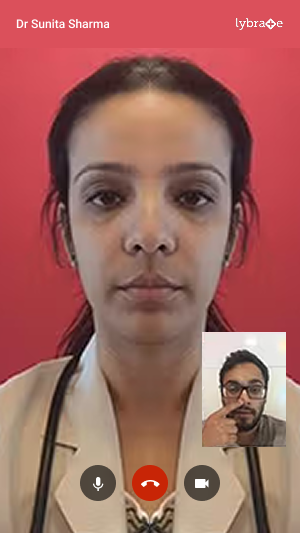
Video call - live consultation with mic, camera, and end call controls
Clean, distraction-free call interface. Doctor's video full-screen, patient's self-view in the corner. Standard controls kept visible but unobtrusive mic mute, camera toggle, end call.
Post-call - consultation summary and digital prescription
Immediately after the call ends, the patient receives a structured summary diagnosis, advice, prescription. Shareable and permanently accessible in their consultation history. The consultation is complete and documented.
Final screens
A new consultation mode on one of India's largest health platforms
The video consultation feature launched and went into production on the Lybrate app, available to all 80L+ registered users. It expanded what Lybrate could offer from a platform where patients asked anonymous questions to one where they could have real, credentialed, face-to-face medical consultations from their phone.
Trust problem addressed
Video eliminated the core ambiguity of chat patients could now see, hear, and verify the doctor they were consulting with in real time.
Access expanded
Users in cities without specialist doctors could consult credentialed specialists anywhere in India. The feature extended Lybrate's reach beyond metro healthcare infrastructure.
Consultation memory solved
The post-call summary meant patients left every consultation with a documented record no more forgetting what the doctor said or losing prescription details.
Foundation for what followed
This feature established Lybrate's telehealth infrastructure at a time when video consultation was still a new behaviour in India well before the COVID-era boom made it mainstream.
What I took away from this project
What worked
Framing the problem as a trust problem rather than a usability problem shaped every decision correctly. Once we understood that patients needed to feel safe not just find the flow easy the design priorities became clear.
The post-call summary was the best outcome of the project. It came from an internal discussion, not from user research, but it addressed a real gap that became obvious once we thought about what happens after the call ends. The best design decisions sometimes come from asking "what happens next?"
What I'd do differently
We designed primarily from PM briefs and analytics data, without direct observation of patients or doctors. For a feature this new introducing a behaviour that Indian users had never done before I would now push hard for at least one round of concept testing before finalising the flow.
Watching someone navigate a video consultation for the very first time, with no guidance, would have surfaced anxieties that data alone can't show.