Users were spending time in the app.
They weren't booking.
Session duration metrics looked healthy users were exploring the app. But the actions that actually matter for Pristyn Care's business form submissions, call clicks, and appointment bookings were disproportionately low relative to the engagement. Users were dropping out somewhere between interest and action.
Lengthy path to conversion
Users had to navigate through multiple screens to reach the primary booking action losing momentum and motivation at each additional step.
High drop rate despite engagement
Extended session times but low form submissions and call clicks, the app was interesting but not converting. Users were reading, not acting.
Doctor listing lacked decision support
Patients couldn't easily compare doctors or understand what differentiated one from another making the selection step a point of hesitation and abandonment.
"The insight wasn't that users didn't want to book, it was that the app was making booking feel harder than it needed to be at every step."
Four targeted changes.
Each at a specific friction point.
Rather than a full redesign, the approach was surgical, identify the specific moments where users were dropping off and address each one directly. Four changes, each solving a distinct problem in the flow.
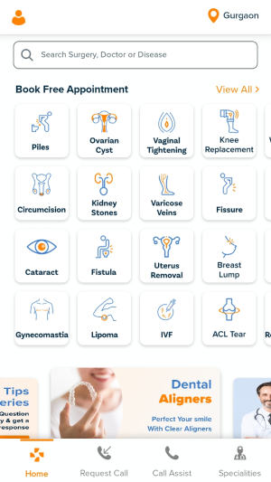
Footer navigation, primary actions always reachable
Introduced a persistent bottom navigation bar giving users direct access to primary conversion points from anywhere in the app. Users no longer needed to find their way back to the home screen to restart a journey, the most important actions were always one tap away.
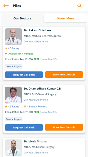
Enhanced doctor listing with comparison-ready information
Redesigned the doctor list screen to surface the information patients actually need to choose specialty, experience, ratings, location, and availability without clicking into each profile individually. Patients can compare and decide at the listing level.
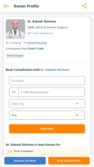
Multiple touchpoints on the Doctor Detail page
Added booking and contact CTAs at multiple scroll positions on the doctor profile, so users who reach a decision point mid-page can act immediately, rather than having to scroll to find the single button at the bottom.
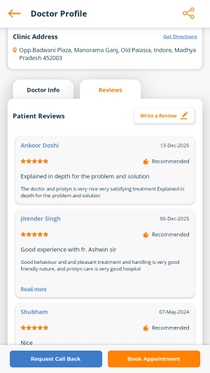
Doctor reviews surfaced earlier in the flow
Moved patient reviews earlier in the discovery experience, visible on the home screen and doctor listing, not just buried inside the profile. Social proof at the moment of hesitation, rather than after the decision has already been abandoned.
The final designs
What changed
Conversion friction reduced
Primary booking actions now reachable from any screen via persistent footer navigation, the path from intent to action shortened at every stage of the journey.
Better decision-making at listing
Patients can compare doctors without clicking into each profile reducing hesitation and improving progression through the booking funnel at the selection stage.
Social proof in the critical moment
Doctor reviews surfaced before the profile click, providing the reassurance patients need at exactly the moment they're deciding whether to continue or abandon.
Live across 12+ surgical specialties
The redesign shipped and went into production, used by patients across Pristyn Care's complete surgical network spanning piles, hernia, gallbladder, ENT, orthopaedics, and more.