Pristyn Care operates at scale
Pristyn Care is one of India's largest surgical care platforms, connecting patients with specialist surgeons across dozens of cities. Every consultation produces a clinical record a document that captures symptoms, examination findings, diagnosis, medications, and next steps. Getting that record right is not optional. It directly affects patient safety.
At the time, there was no structured digital EMR within the Pristyn Care system. Doctors were working around the gap in the only way they knew how.
Paper to photograph to upload. Every single time.
"Before this system, doctors had to write the prescription by hand on a prescription pad, then photograph it with their phone, then upload the photo into the system."
This wasn't an edge case. This was the standard workflow for every consultation at Pristyn Care. It created compounding problems at every stage.
No structure or consistency
Handwritten notes varied by doctor. No standard format meant no way to systematise or search records.
Extra steps, every time
Write → photograph → upload added friction to an already time-pressured consultation. Errors happened. Photos were blurry or incomplete.
No editability once submitted
If a doctor realised they had missed something, the workaround was clunky. There was no clean way to revise a record mid-consultation.
The business need was also clear, Pristyn Care needed structured, searchable, scalable clinical data. Paper photos don't feed into analytics, audit trails, or operational dashboards.
Doctors are not typical app users
We worked from PM-synthesised feedback from real doctors rather than direct user research sessions. This gave us important constraints on how the system had to behave.
Consultations are time-pressured
A doctor filling in an EMR has a patient sitting in front of them. Every extra tap, every confusing screen, every navigation dead-end wastes clinical time.
Doctors think in a clinical sequence
The mental model follows a fixed order, chief complaints → history → examination → findings → diagnosis → management plan. The interface had to match this, not fight it.
Memory is non-linear
During an examination, a patient might mention something that should have been captured two steps earlier. Doctors need to go back without losing their current progress.
Every specialty is different
A gynaecologist's EMR looks nothing like an orthopaedic surgeon's. The system needed to be scalable across all of Pristyn Care's departments without being rebuilt for each one.
How do you navigate a form that never ends?
An EMR is not a simple form. It is a multi-step, multi-section clinical document with up to 8-10 distinct screens depending on the specialty. The first question we had to answer was, how does a doctor move through it?
The initial approach was the obvious one, a linear step-by-step flow with a Next button at the bottom of each screen. Fill in Section 1, press Next. Fill in Section 2, press Next. Standard wizard pattern.
- Doctor fills Chief Complaints, presses Next
- Doctor fills History, presses Next
- Doctor fills Examination, presses Next
- Doctor realises they missed a symptom on screen 1
- Doctor must press Back 3 times, losing context each time
- No way to know at a glance where they are or what's complete
- See all sections at once in a scrollable tab bar
- Jump directly to any section at any time
- See which sections are complete, in progress, or untouched
- Return to an earlier section without losing current work
- Orientation at all times know exactly where you are
We replaced the Next button with a scrollable section navigator at the top of every screen.
Instead of forcing doctors through a rigid sequence, we gave them a persistent horizontal tab bar showing all EMR sections. Each tab shows completion state done, in progress, or not started. Doctors can tap any section at any time. The sequence is suggested, not enforced.
This single decision changed the entire experience. A doctor mid-examination who realises they missed something on Chief Complaints can tap directly back to that section, fix it, and return to where they were without losing their place, without pressing Back multiple times, without frustration.
It also gave doctors a mental map of the entire consultation. At any moment they could see, what have I covered, what's still to do, how far along am I.
The full EMR flow, end to end
Patient information & vitals
Age, gender, weight, height, blood pressure, SPO2, pulse. Pre-populated where available from the patient record. The doctor confirms or updates.
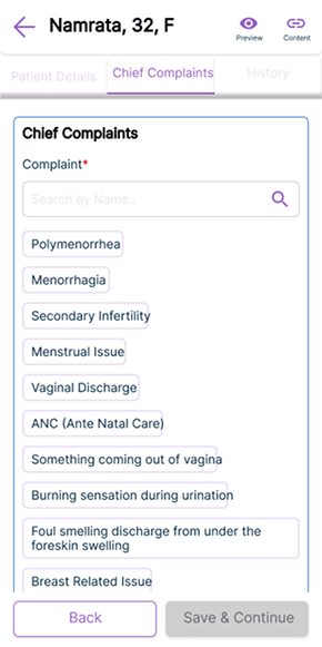
Chief complaints with micro-search
Rather than free-text only, we introduced inline search within the complaints field. Doctors can type a symptom and select from structured options faster to fill, more consistent in output, easier for analytics downstream.
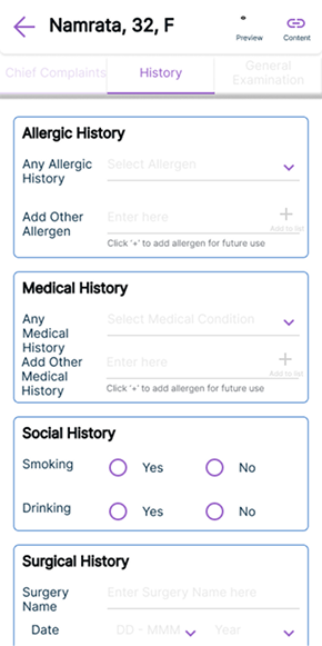
History & allergies
Medical history, surgical history, social history, allergies. Structured fields with quick-select options for the most common entries, keeping this section fast to complete.
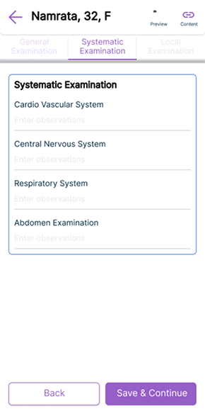
Systematic examination
Cardiovascular, nervous system, respiratory, abdomen the standard clinical examination sequence. Designed to match exactly how doctors are trained to examine patients.
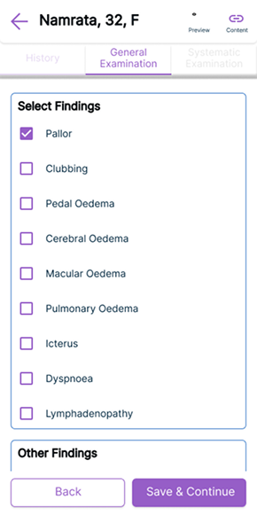
Local & specialty-specific findings
This section adapts by specialty. A gynaecologist sees pelvic examination fields. An orthopaedic surgeon sees joint assessment fields. Same structure, different content built to scale across Pristyn Care's full range of surgical departments.
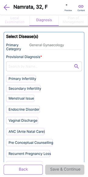
Diagnosis, investigation & management plan
Primary and provisional diagnosis with structured disease selection. Lab tests, diagnostics, medications all selectable from curated lists with the ability to add custom entries.
Saved templates
Doctors seeing the same conditions repeatedly can save their standard entries as templates. One tap to pre-fill a consultation for a common case, then adjust as needed. This dramatically reduced time for high-volume specialties.
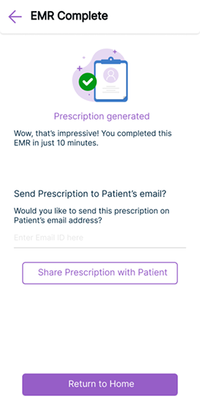
Auto-generated prescription
On completion, the system generates a structured digital prescription automatically formatted, shareable via email directly to the patient. No handwriting. No photographing. No uploading.
Final screens
The scrollable section navigator
Clinical content screens
Auto-generated prescription
From paper on a pad to a structured digital record
The EMR launched and went into production used by doctors across Pristyn Care's network in multiple specialties. The before and after is stark.
Paper eliminated
The handwrite → photograph → upload workflow was replaced entirely with a structured digital flow. Every consultation now produces a clean, searchable, auditable record.
Non-linear navigation solved
Doctors can move freely between sections during a live consultation. No more pressing Back multiple times or losing progress when needing to revise an earlier entry.
Faster with saved templates
High-frequency cases can be started from a saved template, reducing repetitive data entry for doctors who see the same conditions regularly.
Scalable across all specialties
The specialty-adaptive section for local examination means the same system serves gynaecology, orthopaedics, urology, ENT, and general surgery without needing to be rebuilt.
What I learned
What I would do differently
We worked primarily from PM-synthesised doctor feedback rather than observing doctors using the system directly. If I could revisit this project, I would push hard for even one session of watching a doctor complete a consultation the nuances of how they mentally switch between sections, what they actually say out loud when confused, would have sharpened the navigation design significantly.
The saved templates feature came from doctor feedback mid-project. It wasn't in the original brief. That taught me that the most valuable design decisions often come from listening carefully to what users say they do repeatedly then asking "what if we automated that?"
What worked well
The scrollable section navigator was the right call. What seemed like a small navigation decision turned out to be the core UX insight of the entire project that doctors don't fill forms linearly, they think linearly but work non-linearly. Designing for how they actually work, not how the system wanted them to work, was the shift that made the tool trustworthy under consultation pressure.