The idea was simple.
The execution was the point.
Soul Shots came from a genuine frustration, people have thoughts and feelings they want to share but not necessarily attach their name to. Anonymous expression lowers the barrier to honesty. A space where you can say what you're actually feeling without worrying about how it will be received.
But equally important, I built this project to prove to myself that I could take a product all the way from a design concept to a live app on the Play Store without handing off to a developer. Ten years of designing products for other people to build. Soul Shots was the first thing I designed and shipped entirely myself.
"Most designers say they understand how their designs get built. I wanted to actually know by doing it myself."
Design to production
one person
Every part of this product was done by me the UX thinking, the visual design, the code, and the deployment. No handoff, no back-and-forth with a developer. This is what end-to-end ownership actually looks like.
UI/UX Design - Figma
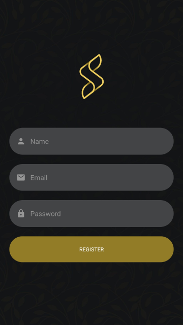
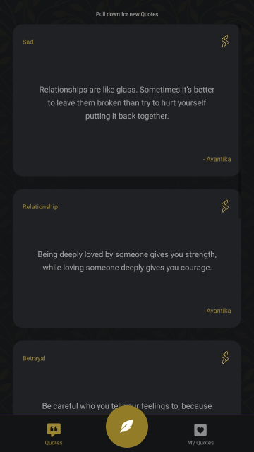
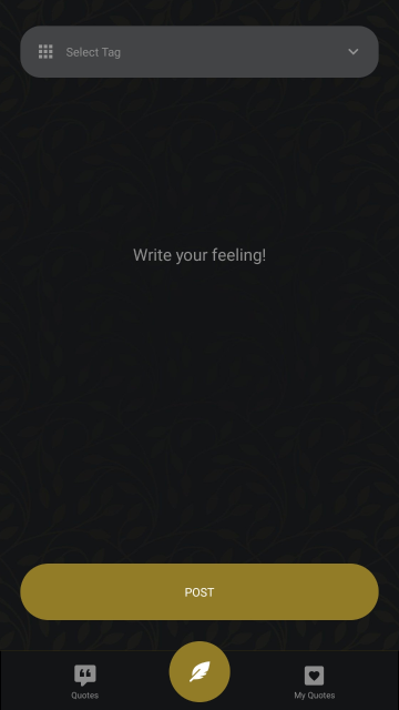
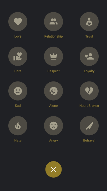
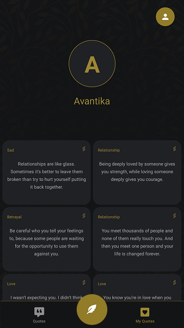
Full wireframes through to high-fidelity screens. Dark theme throughout the anonymity concept shaped the visual direction. Gold accent for key actions, clean typographic hierarchy, and a card-based content system for the anonymous post feed.
Development - React Native & JavaScript
Cross-platform mobile app built in React Native, one codebase targeting both iOS and Android. Smooth, responsive experience across device sizes. This project gave me first-hand understanding of component architecture, state management, and mobile performance constraints that directly improves how I design for developers at work.
Deployment - Google Play Console
Managed the full release process build configuration, signing, Play Console setup, store listing, screenshots, and live deployment.
Design screens

Building makes you
a better designer
Every design decision I've made since Soul Shots has been shaped by actually building it. When you write the code yourself, you understand why certain design patterns are hard to implement, what makes a component reusable, and where the gap between "looks good in Figma" and "works on a real device" actually lives.
Specific things I now know from building rather than just designing, touch target sizes that feel right on paper but are wrong on a real phone, how scroll performance is affected by too many animated elements in a feed, and why a 3px border radius and a 4px border radius look identical in Figma but genuinely different on screen.
This is the kind of knowledge that makes me more useful to the engineering teams I work with not just a designer who draws screens, but one who understands what happens when those screens get built.